Antony Andreas

A productivity analytics system that can aid intracking productivity and encourage balanced routines for peopleworking at home.
This case study explores how India’s film ratings can move beyond censorship to become cultural guidance for 1.4B viewers. It proposes a system-level redesign — spanning interface, policy, and curriculum — showing how design leadership can turn regulation into empowerment.
This case study explores how India’s film ratings can move beyond censorship to become cultural guidance for 1.4B viewers. It proposes a system-level redesign — spanning interface, policy, and curriculum — showing how design leadership can turn regulation into empowerment.
This case study explores how India’s film ratings can move beyond censorship to become cultural guidance for 1.4B viewers. It proposes a system-level redesign — spanning interface, policy, and curriculum — showing how design leadership can turn regulation into empowerment.
This case study explores how India’s film ratings can move beyond censorship to become cultural guidance for 1.4B viewers. It proposes a system-level redesign — spanning interface, policy, and curriculum — showing how design leadership can turn regulation into empowerment.
This case study explores how India’s film ratings can move beyond censorship to become cultural guidance for 1.4B viewers. It proposes a system-level redesign — spanning interface, policy, and curriculum — showing how design leadership can turn regulation into empowerment.


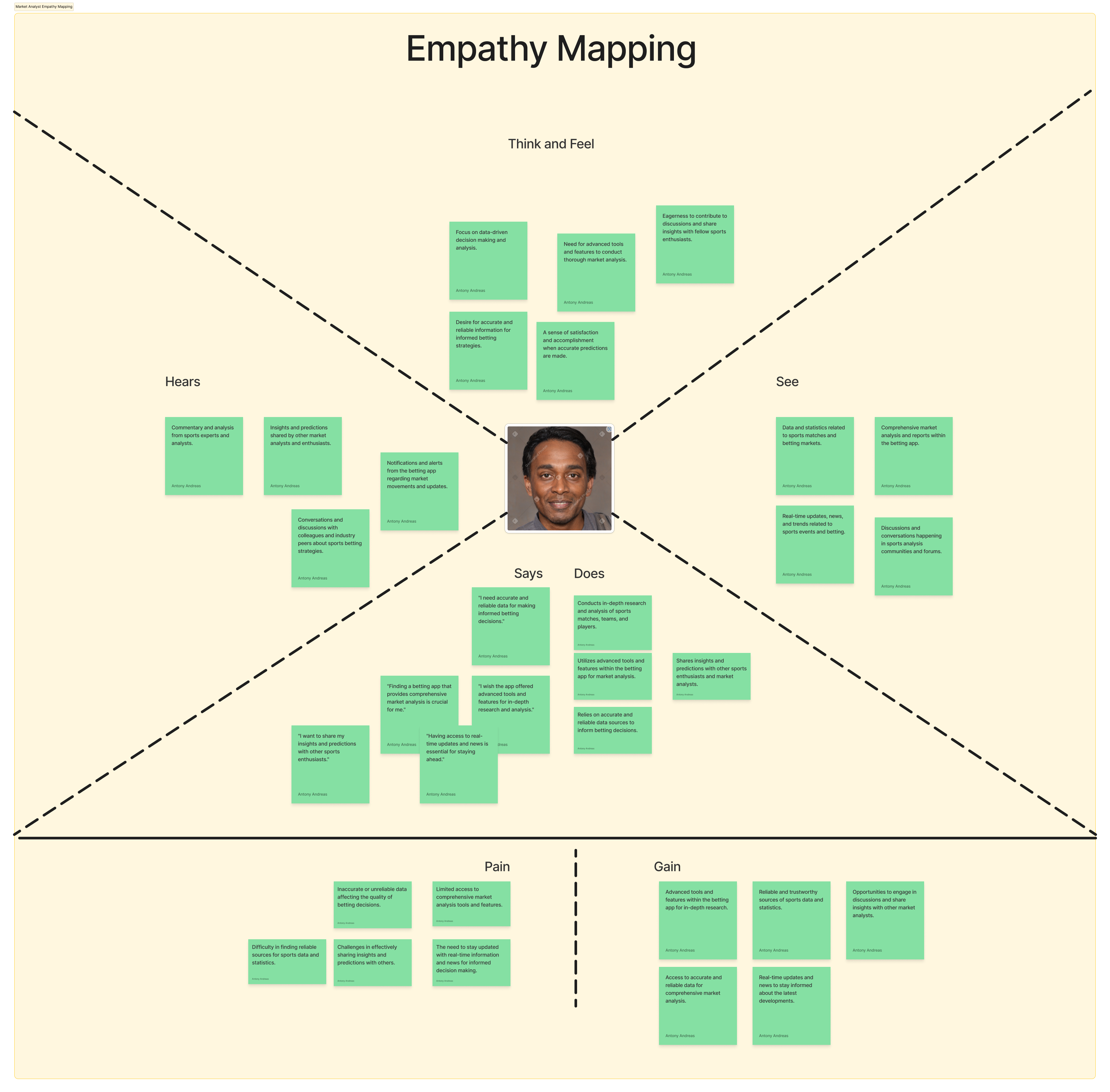
Problem
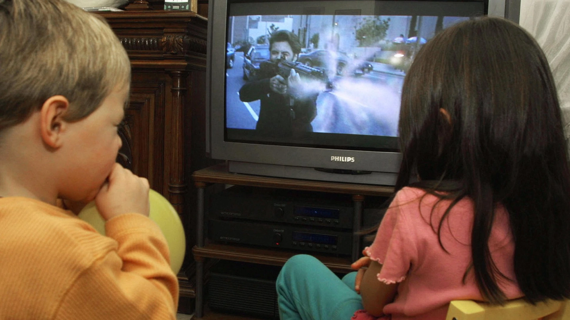
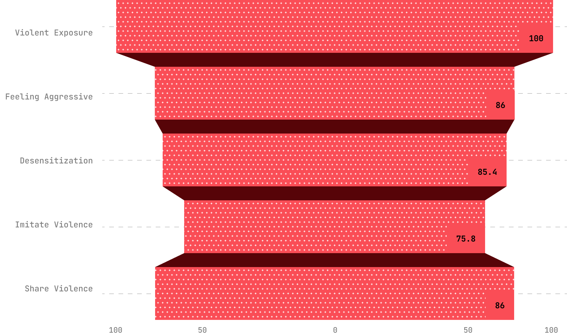
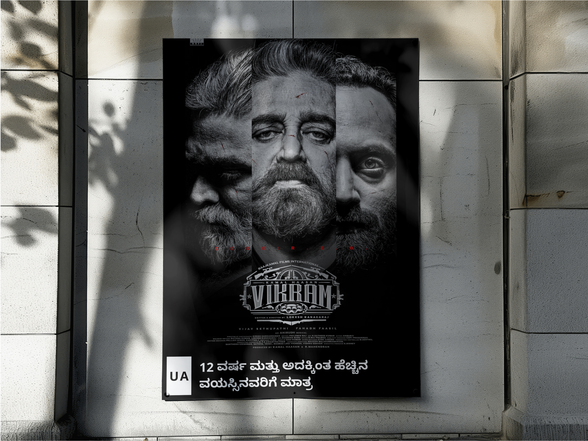
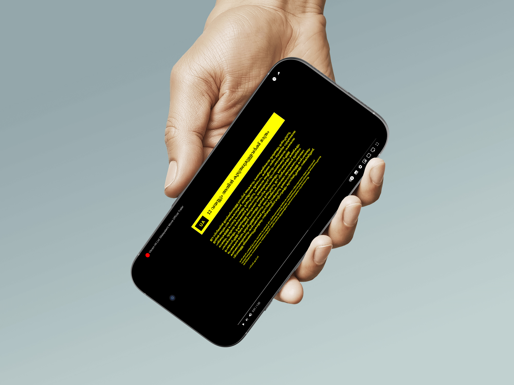
For young viewers still forming moral judgment and personal identity, repeated exposure to charismatic film protagonists who engage in “justified” violence can normalize aggression and frame emotional repression as a marker of strength, fostering unhealthy models of masculinity and interpersonal conduct. Drawing on Social Learning Theory (Bandura, 1977), such portrayals become behavioural templates as youth observe and internalize the rewarded actions of these role models. Cultivation Theory (Gerbner & Gross, 1976) suggests that persistent themes of vigilante justice and gendered violence create a symbolic environment where aggression is perceived as heroic and socially endorsed. Desensitization Theory further explains how aestheticized violence, as seen in films like Animal, KGF, and Pushpa, can dull emotional responsiveness and increase tolerance for aggressive solutions. While Reception Theory recognizes that audiences actively interpret media, the consistent glamorization of violence in these narratives exerts a strong shaping force on impressionable viewers, influencing their long-term beliefs and behavioural norms.
Methodology
To capture the complexity of this problem, I designed a triangulated mixed-methods study that combined:
Analysed 16 peer-reviewed studies and international rating frameworks. Applied Social Learning Theory, Cultivation Theory, Desensitization Theory, and Reception Theory to interpret findings.
Studied 13 high-grossing Indian films from Hindi, Tamil, Telugu, Malayalam, and Kannada industries.
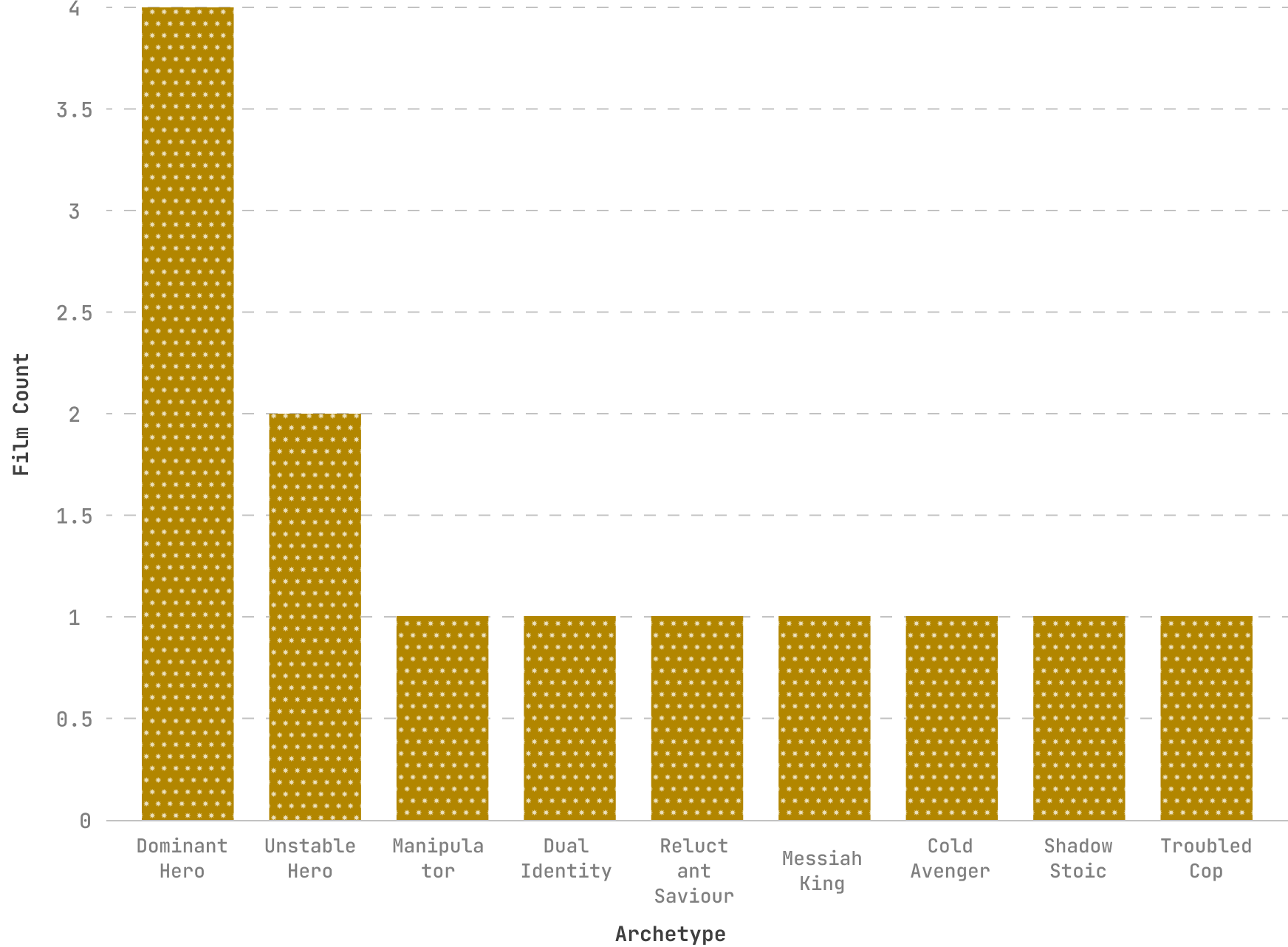
Introduced a custom schematic coding framework to map protagonist archetypes, narrative arcs, and the cinematic techiniques used to aestheticize violence. This framework identified 9 recurring anti-hero archetypes and tracked how moral justification, visual style (e.g., slow-motion, colour grading), and audio cues (e.g., heroic scoring) worked together to frame aggression as aspirational.
Enabled cross-film comparison, revealing consistent patterns in how violence is contextualized and normalized across genres and regions.
Surveyed 15 participants across 18 to 60 age groups. Focused on awareness, trust, and behavioural use of CBFC ratings.
*Note: While the survey sample (N=15) is modest and cannot be generalized statistically, it was designed as an exploratory probe to complement the broader content analysis and literature review. Triangulating across methods allowed me to balance depth (film coding, theory application) with audience perspective, even if the survey itself represents a small, primarily urban cohort.
Research & Discovery
Studying how violent media influences audiences especially in a country where cinema is a cultural force wasn’t as simple as asking, “Hey, do you think films influence you?” Most people don’t believe they are influenced, even when evidence points otherwise.
To understand the gap between awareness and action, I explored the issue from multiple angles: analysing blockbuster films, and grounding findings in decades of media-effects research. The result was a clear picture of why India’s content rating system fails to guide viewing choices and how cinematic portrayals of violence can subtly shape attitudes.
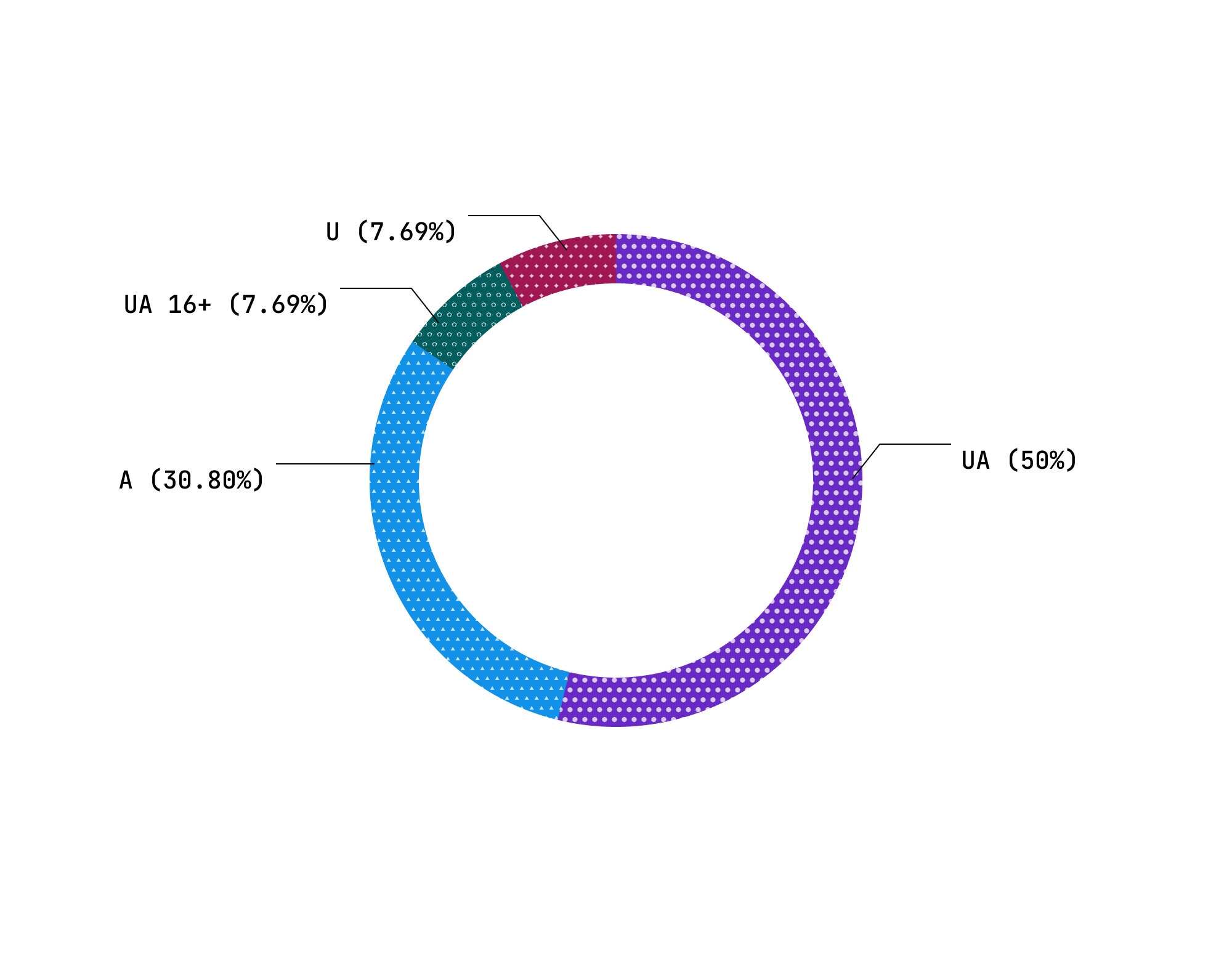
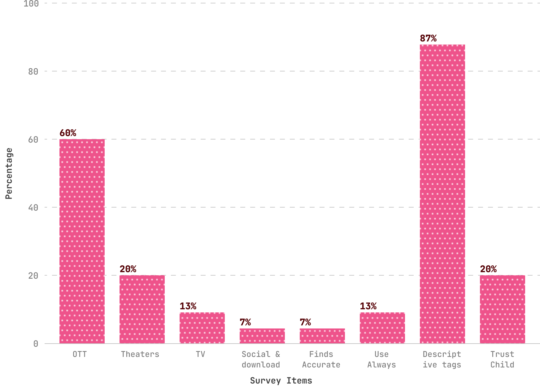
Some participants had never noticed ratings before; only 1 of 15 respondents knew about newer categories like UA 7+, UA 13+, and UA 16+.
Just 7% of participants believed CBFC ratings were accurate, and only 20% considered them reliable for decision-making.
Age bands provide no information about the type or intensity of potentially harmful scenes, meaning two “UA” films can have entirely different psychological impacts.
Literature and survey data confirm that younger viewers are more likely to adopt behaviours from admired on-screen figures, especially when aggression is rewarded or portrayed as justified.
Content analysis of 13 films revealed 9 recurring anti-hero archetypes that glamorize aggression through slow-motion hero shots, mythic music, and moral justifications.
Ratings are inconsistently displayed across OTT, theatre, and promotional platforms, reducing their visibility at decision-making moments.
Solution
A redesigned CBFC rating ecosystem that bridges the awareness–action gap by making ratings transparent, descriptive, inclusive, and actionable across all media platforms.


Empowering by design
From the outset, I've committed to making film ratings and content guidance not just visible, but genuinely useful for audiences. This meant creating a system where ratings, descriptors, and advisories are consistent, easy to understand, and accessible in multiple languages across theatres, OTT platforms, posters, and trailers.
Fogg’s Model
To understand how these interventions actually change audience behaviour, I applied Fogg’s Behavioural Model (Motivation, Ability, and Prompt). This helped frame ratings not just as information, but as nudges that guide real-world choices.
Parents and young viewers are motivated by safety, clarity, and autonomy. By framing ratings as protective and empowering (rather than restrictive), we tap into these cultural and emotional drivers.
Simplified, multilingual, and visually consistent ratings reduce friction. Paired with descriptive warnings and parental controls, they make responsible viewing both easy and practical.
Nudges appear at the right moments: prominent labels beside posters and thumbnails, non-skippable pre-playback advisories, and interactive explainers built into OTT onboarding. Audience feedback polls serve as continuous prompts, showing that their voice shapes the system.
From Gatekeeper to Guide
In this model, the CBFC evolves from a statutory gatekeeper into a transparent, participatory, and empowering guidance system. Ratings stop being hidden fine print and instead act as active educational tools.
For viewers, it means informed choices and safer, developmentally appropriate media exposure.
For parents and educators, it provides practical scaffolding to co-view, mediate, and discuss challenging content.
For filmmakers, a transparent and descriptive system fosters trust and fairness. Instead of opaque or inconsistent classifications, clear criteria and content descriptors reduce the risk of misclassification and minimize disputes with the CBFC. Transparency also helps mitigate backlash, as audiences understand why a film carries a particular rating rather than assuming bias or censorship.
For directors and producers, this clarity provides a safeguard against reputational harm, streamlines the certification process, and aligns creative choices with audience expectations without stifling artistic expression. Over time, such reforms can shift the relationship between filmmakers and regulators from adversarial to collaborative where ratings are seen not as obstacles, but as tools that build audience trust.
Media Literacy Curriculum Development for Indian Youth
Indian youth are among the world’s largest consumers of cinema and OTT media, yet existing CBFC ratings fail to guide young viewers effectively. Research shows that without structured media education, children and adolescents are at risk of normalizing violence, toxic gender roles, and risky behaviors depicted in films.
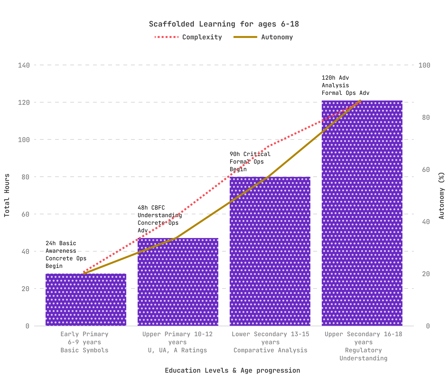
I designed a comprehensive curriculum framework that integrates with Indian schools (CBSE/NCERT) and global standards (UNESCO Media Literacy). The framework uses interactive explainers, infographics, and multilingual content to scaffold media literacy from early childhood to late adolescence.
I divided the curriculum into four developmental stages, aligned with Piaget’s cognitive development model. This four-tier age group structure (6-9, 10-12, 13-15, and 16-18 years) offers optimal cognitive alignment while the multilingual implementation strategy ensures accessibility across India's diverse linguistic landscape.
Learning the difference between “real vs. pretend.” Symbols and simple rating icons.
During this concrete operational stage beginning, children develop the ability to think logically about concrete objects and events. The curriculum focuses on basic media symbol recognition, distinguishing between real and pretend content, and establishing foundational safety awareness. This aligns with UNESCO's emphasis on starting media education early and supports the Google-NCERT Digital Citizenship framework implemented across Indian schools.
Introduction to CBFC ratings and content warnings. Building awareness of “age-appropriate” content.
As children advance in concrete operational thinking, they can handle more sophisticated classification systems. This level introduces CBFC rating understanding and content descriptor analysis, building on India's existing mass media literacy initiatives while developing critical thinking about age-appropriate content consumption.
Critical engagement with media effects, peer influence, and social media literacy.
The transition to formal operational thinking enables abstract reasoning about media influence and peer dynamics. This curriculum level addresses critical engagement with media effects and develops digital citizenship skills essential for navigating social media responsibly.
Advanced analysis of film narratives, Fogg Behaviour Model application, and policy-level awareness.
Advanced formal operational capabilities support sophisticated analysis of media narratives, behavioral psychology applications (including Fogg Model implementation), and policy-level thinking about media regulation and social responsibility.
Outcomes (Projected)
If descriptors, advisories, and consistent UI display were implemented, audience trust in CBFC ratings could plausibly rise from today’s ~13% baseline toward majority levels (e.g., 50–60%), as indicated by analogous reforms in the UK and US. Post-viewing audience surveys would help validate this trend.
Seamless PIN/biometric locks and pre-playback warnings could reasonably increase parental feature adoption by 2–3x on OTT platforms, based on uptake rates in international contexts.
Integrating a structured media literacy curriculum into schools has the potential to reduce “blind viewing” among ages 10–16 by an estimated 30–40%, depending on implementation scale and teacher engagement.
With standard descriptors and transparent governance, India’s classification framework could approach parity with BBFC (UK) and MPA (US) standards within 5 years, positioning CBFC as a trusted guidance body rather than a censor.
Reflection
Learned the limits of being a single researcher without inter-rater reliability, humility and transparency were key, yet triangulation across survey, content analysis, and literature review gave my findings strong validation.
This Independent research taught me to double down on ethical rigor and methodological clarity to ensure credibility even without institutional backing.
Realized that international frameworks (BBFC, ACB, MPAA) cannot be copy-pasted into India cultural, linguistic, and demographic realities demand localized solutions.
For instance, OTT platforms often display rating advisories prominently in English, but not in regional interfaces, leading to unequal visibility across linguistic groups.
Similarly, parents in rural areas reported relying more on word-of-mouth or local cable operators than on official CBFC classifications, while urban parents were more likely to encounter ratings through streaming apps.
These differences underscored that language and access are not peripheral issues, but central design barriers. Multilingual and culturally appropriate descriptors are a necessity, not an afterthought. Rural–urban divides in media access reshaped my understanding of audience diversity and how different groups interpret the same content differently.
Saw firsthand the tensions between freedom of art, parental protection, commercial interests, and regulatory oversight all competing in the same ecosystem.
Parents often act as proxy decision-makers, meaning design must account for indirect users as much as direct ones.
Balancing expert frameworks vs. lived experience highlighted that what academics recommend doesn’t always match what audiences/parents actually need.
Understood that policy constraints directly shape design CBFC classifications ripple into OTT UX, theatre systems, and promotional media.
Learned that true reform requires systems thinking: media literacy cannot be solved by UI tweaks alone, but through educational, cultural, and regulatory layers working together.
Realized how difficult it is to capture implicit influence audiences don’t perceive how films shape their values. This demanded going beyond surveys to content analysis + theory-driven interpretation.
Saw the challenge of short-term vs. long-term effects: cinema’s influence on youth identity unfolds over years, not weeks, complicating measurement.
Moved from assumptions to evidence starting with a hunch about violent cinema, then systematically testing and refining it through rigorous methods.
Practiced academic storytelling for policy impact, turning raw findings into actionable recommendations for systemic change.

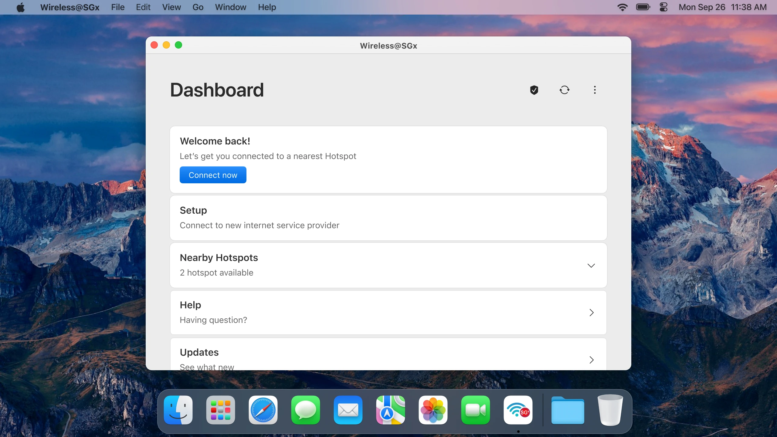
The Design Challenge
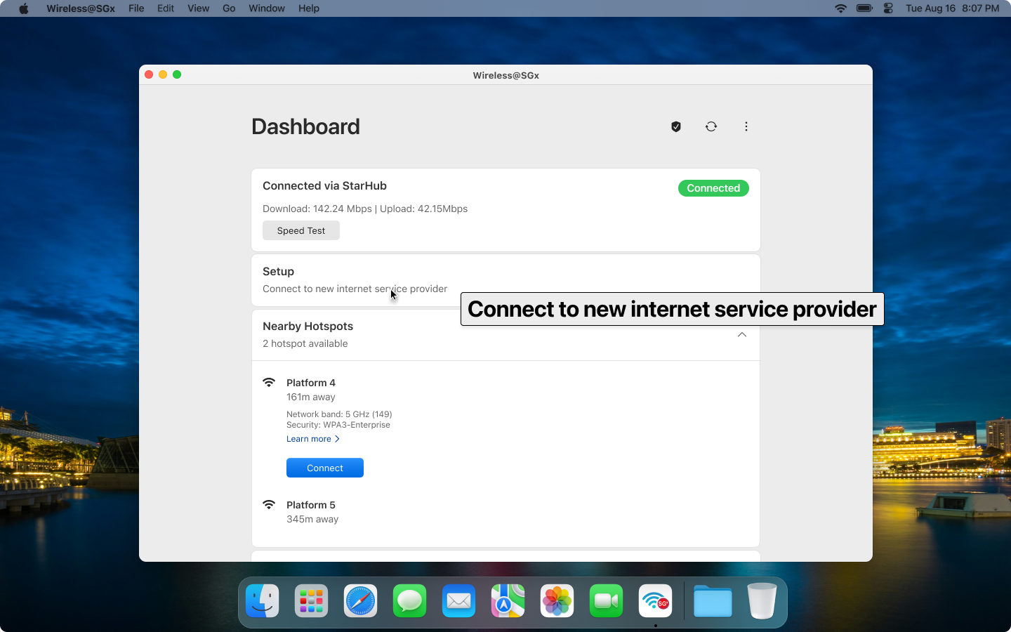
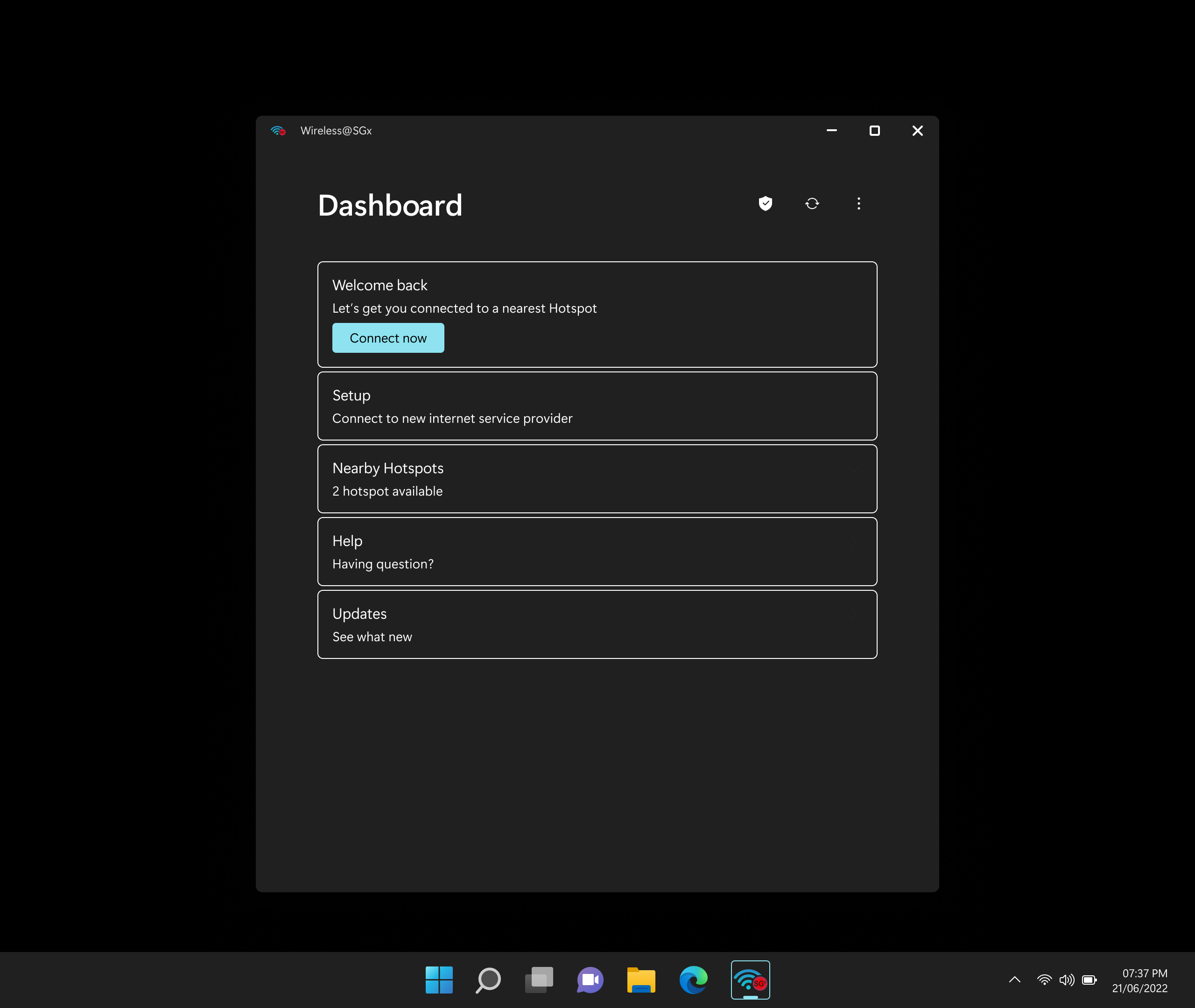
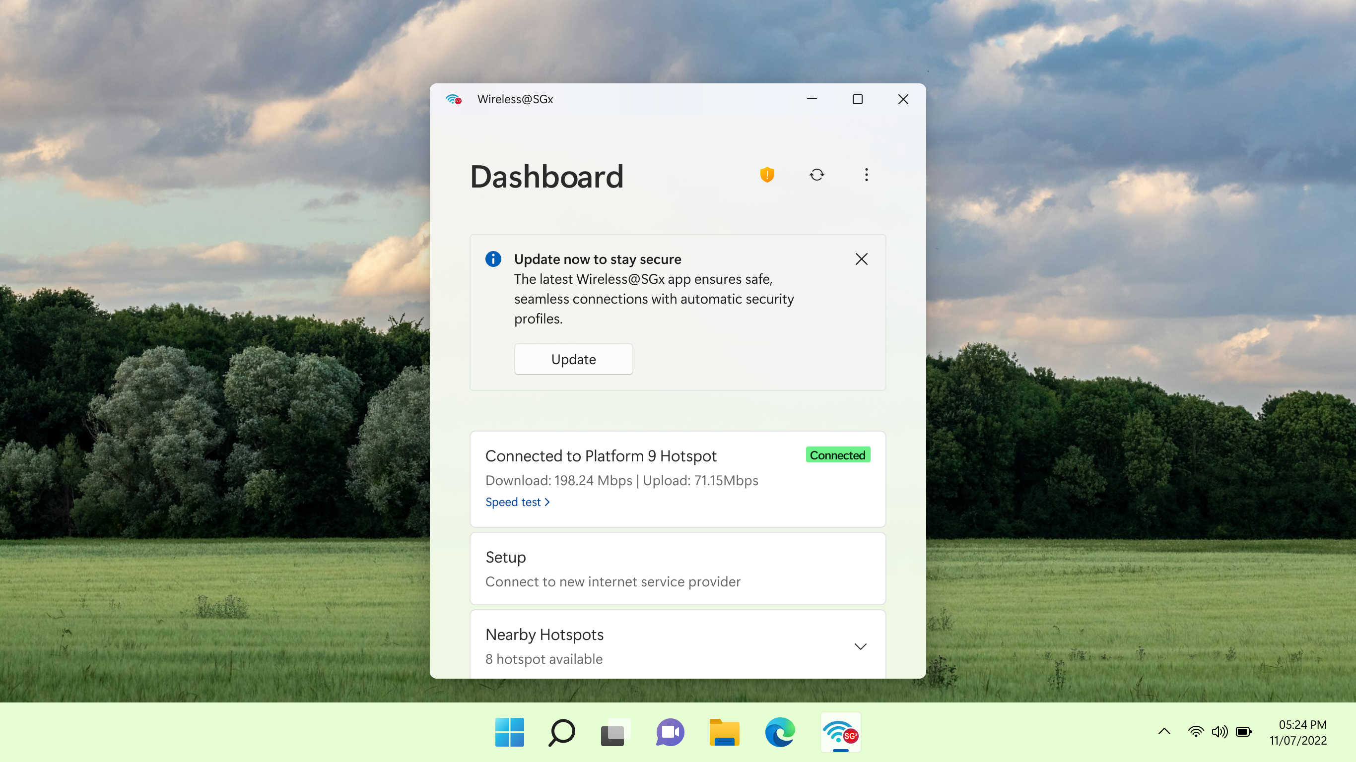
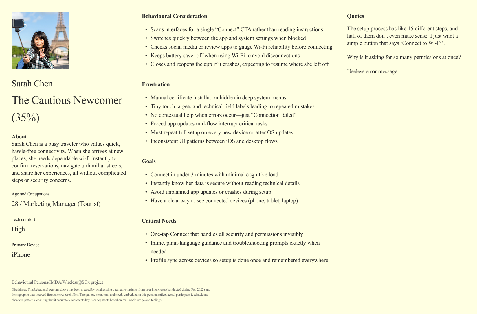
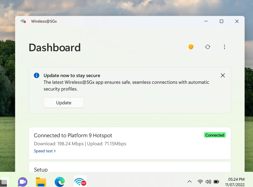
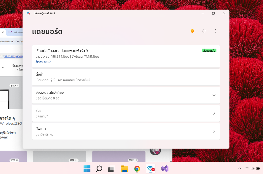
Wireless@SGx application was failing to deliver accessible public Wi-Fi for all citizens and visitors. The application demonstrated severe usability failures that threatened Singapore's digital inclusion objectives and international reputation for technological excellence.

Research Method
I applied a mixed-methods UX research methodology, combining quantitative surveys and qualitative interviews, followed by affinity mapping and assumption testing. This approach, allowed me to benchmark usability, synthesize insights into key problem areas, and reframe the service around accessibility, reliability, and inclusion.
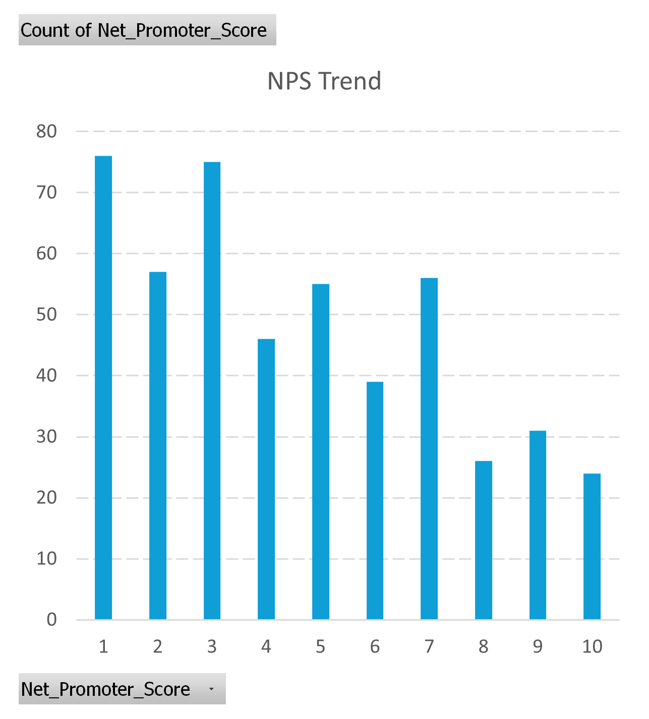
Surveyed 485 respondents across iOS, Android, Windows, and macOS between Feb–August 2022. Collected metrics on setup completion rate, user satisfaction, Net Promoter Score, and average setup time.
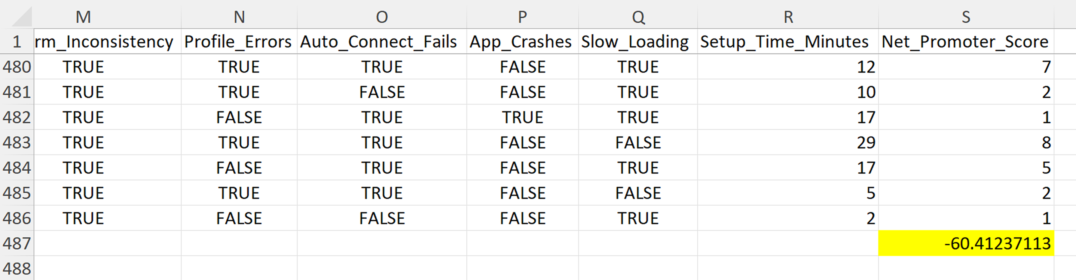
Note: The quantitative survey (N=485) achieves robust statistical significance with 95% confidence and ±4.4% margin of error, with all key findings showing p < 0.001 and large effect sizes. While statistically powerful for UX research standards and sufficient for detecting meaningful usability differences (≥15%), the survey was designed as comprehensive behavioural mapping to complement in-depth qualitative interviews and systematic thematic analysis. Triangulating across methods allowed balancing statistical precision (tight confidence intervals: ±3.9-4.3% for major findings) with rich contextual insights (cross-platform user experiences and accessibility barriers), though desktop platform subgroups represent smaller cohorts with wider confidence intervals (Windows n=38, ±15.9%; macOS n=33, ±17.1%).
I conducted 8 semi-structured interviews with participants aged 22–67, representing a mix of students, professionals, and seniors. These sessions explored lived experiences, contextual barriers, and accessibility challenges that could not be fully captured in survey data.
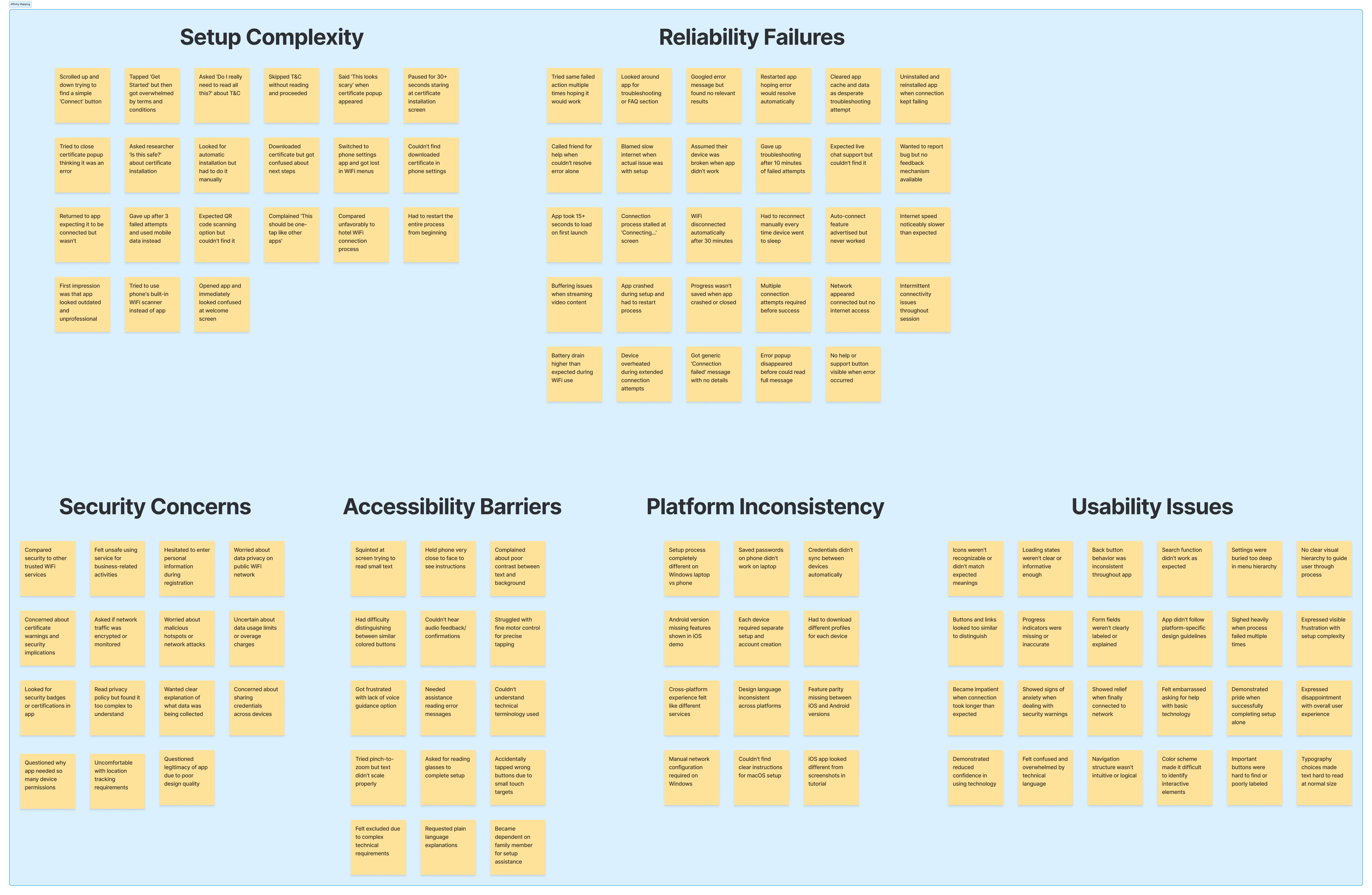
The interview data was then synthesized using affinity mapping, which clustered observations and quotes into emergent themes. This ensured that recurring issues were identified systematically and provided a structured foundation for defining critical user needs.
.png)
Finally, I ran an assumption-busting exercise by explicitly listing IMDA’s original design assumptions and systematically testing each against collected evidence. This step ensured the redesign strategy was based on user realities rather than unvalidated expectations.
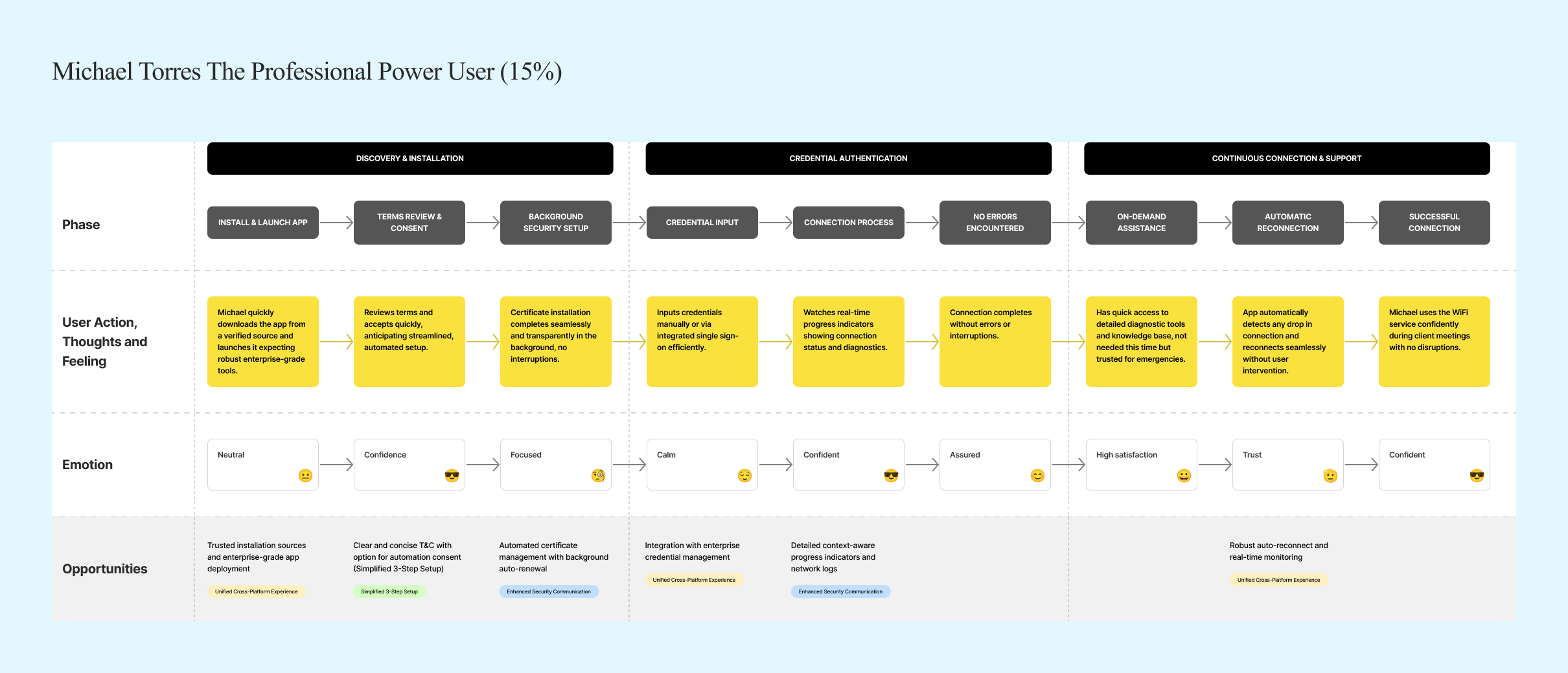
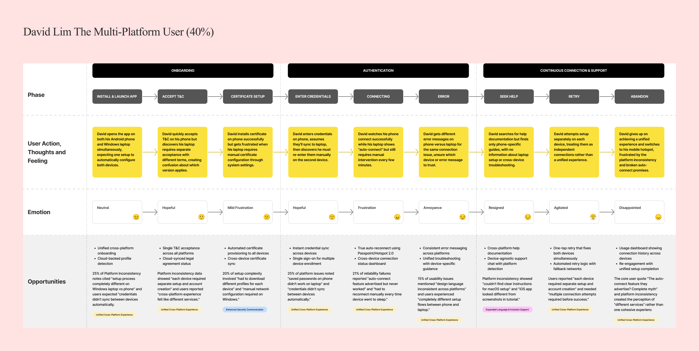
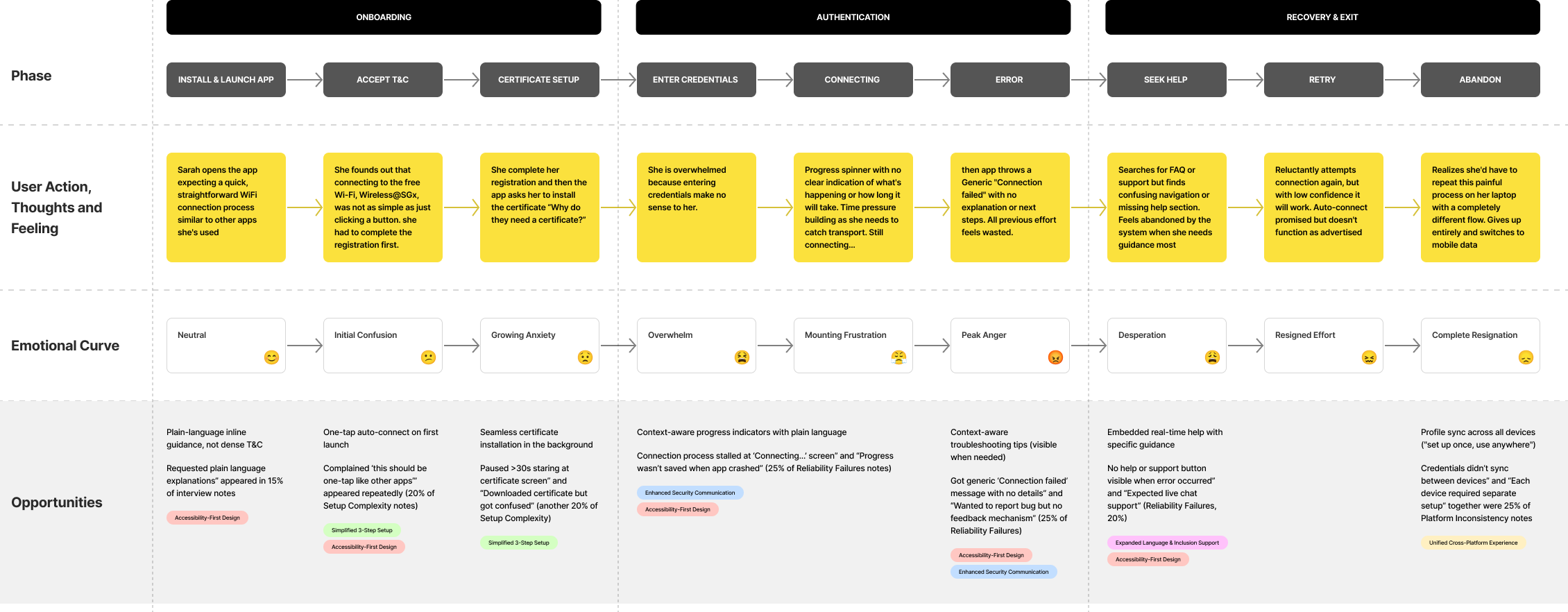
User Journey Mapping
.png)
.png)
Findings
Our research revealed that the barriers to Wireless@SGx adoption were not technical glitches, but deep-rooted experience failures. Instead of being a seamless public utility, the service felt fragmented, outdated, and exclusionary.
On average, users faced 15+ steps involving technical jargon and certificate installations. The setup process took over 11 minutes, far exceeding the expected 2–3 minutes.
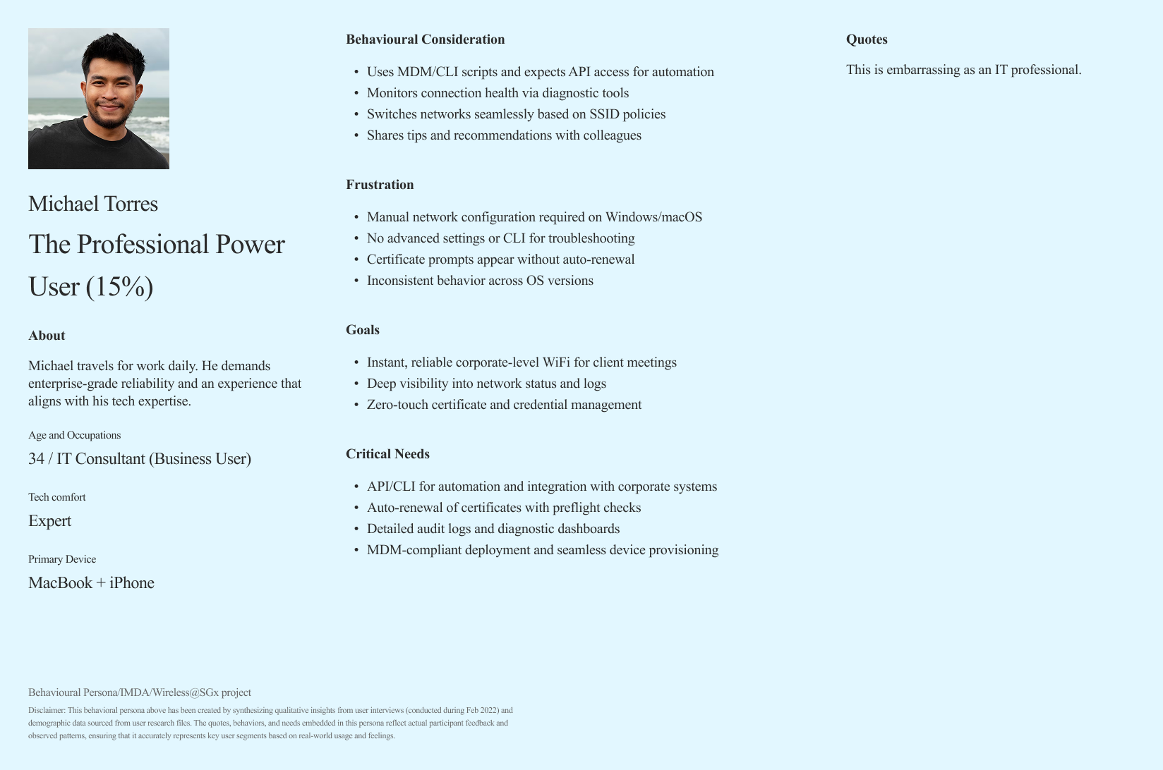
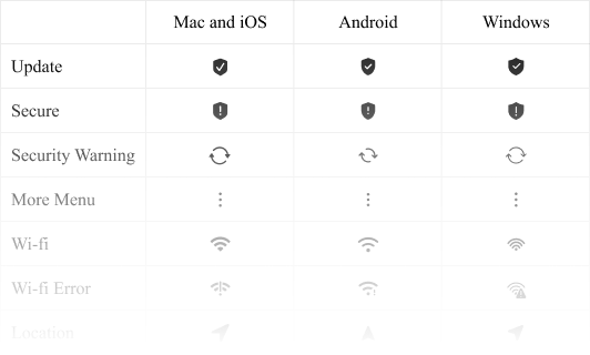
Each platform (iOS, Android, Windows, macOS) had a different flow, requiring users to “re-learn” the process. Lack of consistency created unnecessary cognitive load.
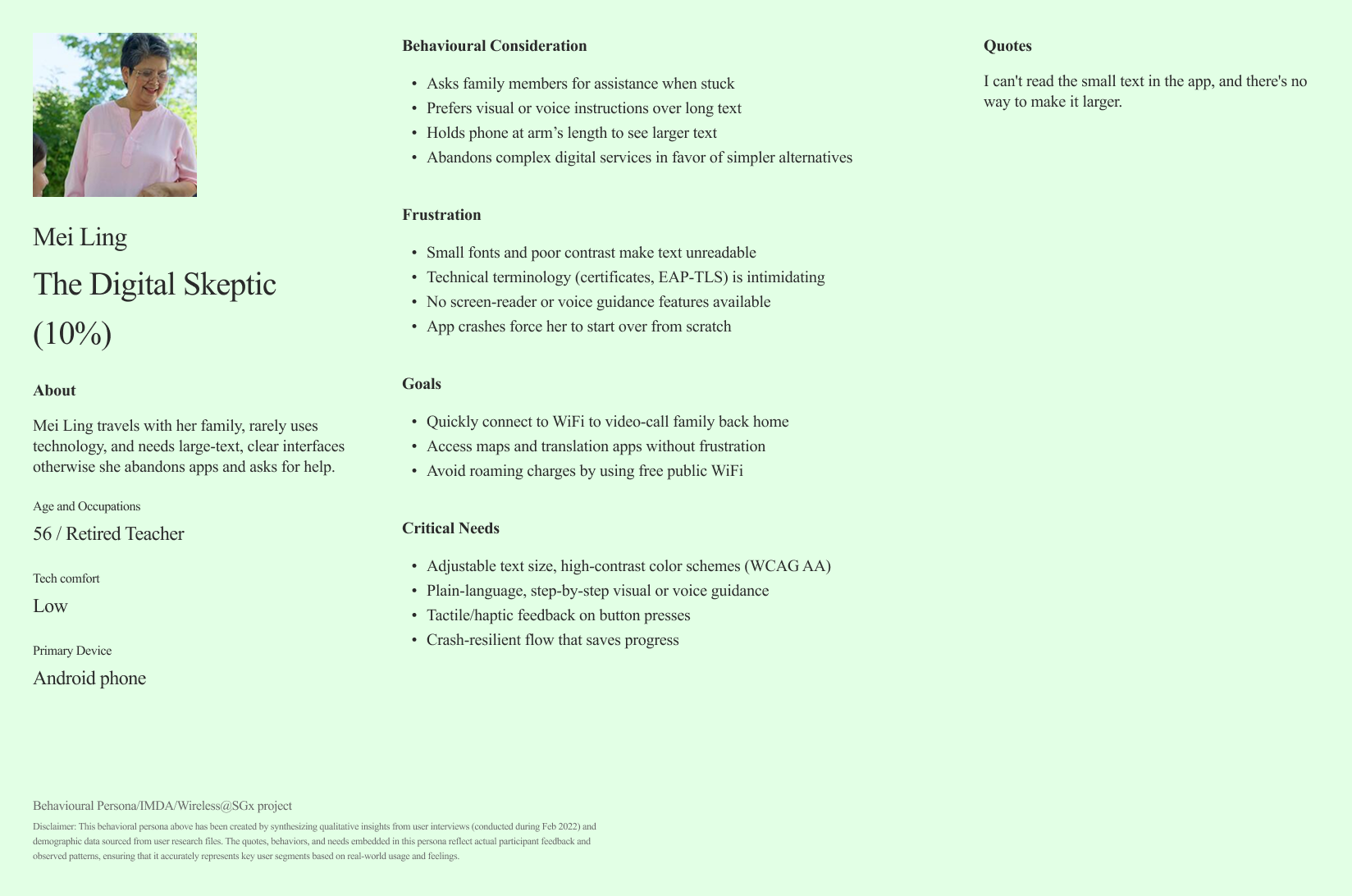
Outdated interface design (last refreshed in the 2010s). Tiny buttons, dense instructions, and jargon-heavy language made navigation frustrating.
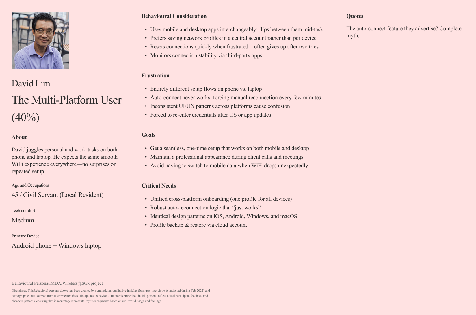
Seniors struggled with small text and low contrast. Many depended on intergenerational help (e.g., asking children or grandchildren) just to get connected.
Frequent, unexplained disconnections. Auto-connect one of the app’s core promises rarely worked reliably.
Manual credential copying introduced unnecessary friction and errors. Confusing certificate warnings reduced user trust in the service.

Design Approach
I approached this complex challenge through a systematic, user-centred design process focused on accessibility, consistency, and simplification.
Building on existing user research (485 person survey and 8 interviews), I analysed user pain points, behavioural patterns, and accessibility barriers. This revealed six critical themes: setup complexity, platform inconsistency, usability issues, accessibility barriers, reliability failures, and security concerns.
From these insights, I developed a design strategy anchored in three guiding principles: Accessibility-First Design, ensuring WCAG 2.1 AA compliance and inclusive features for all users; Cross-Platform Consistency, creating unified experiences across iOS, Android, Windows, and macOS to eliminate fragmentation; and Radical Simplification, reducing complexity by streamlining multi-step flows into intuitive, minimal processes without sacrificing functionality.
Mapped research insights into clear problem statements and design opportunities.
Established accessibility, consistency, and simplicity guidelines to anchor decision-making.
Restructured user flows to reduce steps and cognitive load.
Developed low-fidelity to high-fidelity prototypes across all platforms.
Built a cross-platform component library to ensure consistency and scalability.
Conducted iterative testing with seniors, students, and professionals to validate improvements.
Collaborated closely with developers to align build quality with design intent.
I mapped research insights into clear problem statements, defined accessibility, consistency, and simplicity as guiding principles, restructured user flows to reduce cognitive load, prototyped across platforms, built a cross-platform design system, validated improvements through iterative testing with diverse users, and collaborated with developers to ensure faithful implementation.
Solutions
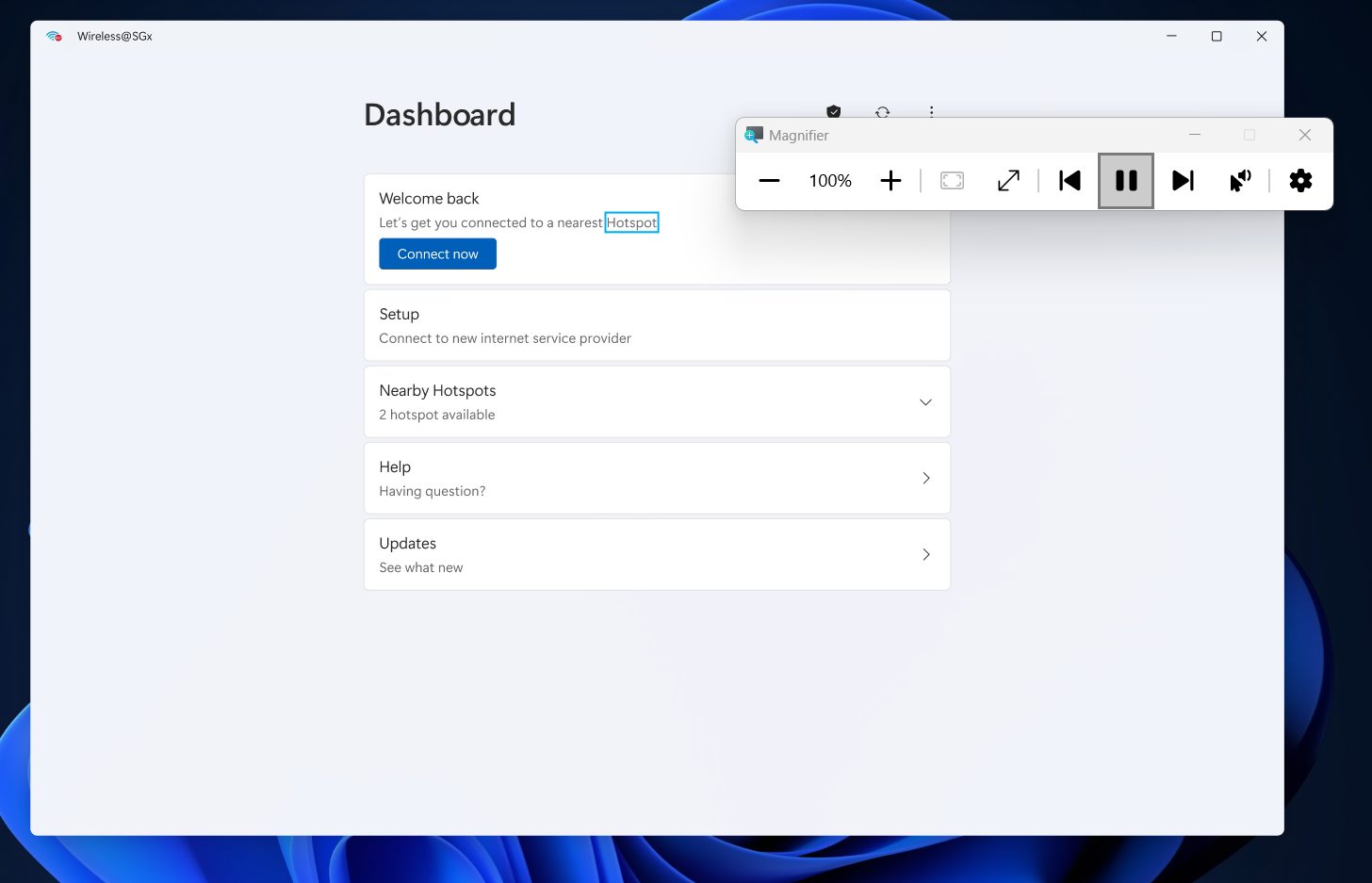
The solution I designed was a complete Wireless@SGx ecosystem redesign: transparent, unified, accessible, and actionable across all platforms.

Users reported overwhelming 15-step setup processes requiring technical knowledge and creating barriers across all platforms.
Reduced setup time from 11+ minutes to under 3minutes while increasing completion rates from 36.7% to 78%.

Seniors faced 80-100% confusion rates with no accessibility features available, creating systematic exclusion
Increased senior user success rates from under20% to over 75% while maintaining modern, appealing design for all users.

Simplified 3-Step Setup
Users reported overwhelming 15-step setup processes requiring technical knowledge and creating barriers across all platforms.
Consistent Profiles
Each platform (iOS, Android, Windows, macOS)provided different setup flows, forcing users to "re-learn" processes for each device.
I created a comprehensive design system ensuring95% feature parity across all platforms
Accessibility-First Design
Seniors faced 80-100% confusion rates with no accessibility features available, creating systematic exclusion
Core Solutions and Results
Accessibility-First Design
Unified Cross-Platform Experience
Simplified 3-Step Setup

Enhanced Security Communication
Expanded Language & Inclusion Support
Mandatory Connection Advisories
Few other solutions
Expanded Language & Inclusion Support
Mandatory Connection Advisories
Outcomes
Increased from 36.7% to 78% within the first quarter post-launch, meeting the target set in the redesign roadmap.
Grew from 13% to 80% as measured by post‐launch surveys, reflecting major improvements in ease of use and perceived reliability.
Shifted from –60.4 to +15 within six months, indicating a positive user recommendation trend and restored trust in the service.
Reduced from 11.1 minutes to 2.7 minutes, surpassing the under-3-minute goal for streamlined onboarding.
Achieved 100% WCAG 2.1 AA compliance, enabling senior and low-vision user success rates to climb from 20% to 75% in usability tests.
Realized 95% feature parity across iOS, Android, Windows, and macOS, cutting cross-platform support tickets by 50% in the first release cycle.
Declined by 60% for setup-related issues thanks to embedded help prompts and clear error advisories, reducing operational load on support teams.
Reflection
Designing for seniors and users with disabilities pushed innovative solutions that benefited all users. The accessibility-first approach resulted in design patterns that improved usability across the board, proving that inclusive design creates better experiences for everyone.
The challenge of reducing 15 steps to 3 steps taught that true simplification requires understanding user goals rather than removing features. Smart defaults and progressive disclosure became powerful tools for managing complexity while maintaining functionality.
Creating unified experiences across platforms required deep understanding of each platform's design principles while maintaining brand consistency. This balance between platform conventions and unified experience became crucial for user trust and learning transfer.
Combining quantitative validation (n=485) with qualitative insights (n=8) provided comprehensive understanding that neither method could achieve alone. This approach enabled evidence-based design decisions with statistical confidence while capturing contextual user needs.
Singapore's diverse user base (locals, tourists, business travelers) required culturally sensitive design approaches that respected different technological expectations and usage contexts. This highlighted the importance of considering cultural factors in government digital services.
Working within government constraints while pushing for user-centered design required careful stakeholder management and evidence-based advocacy. Data-driven design decisions proved essential for gaining buy-in for comprehensive redesign.
Utilising design system for iOS, Android, Windows, and macOS balanced cross-platform consistency with native conventions, enabling rapid feature parity and reducing development overhead while maintaining performance on older devices through careful optimization.
Embedding comprehensive WCAG 2.1 AA accessibility features adjustable text sizes, high-contrast modes, and haptic feedback alongside performance tuning proved that inclusive design and efficient performance can coexist.
This scalable foundation and accessibility framework now serve as a blueprint for future government digital services, advancing Singapore’s Smart Nation goals by making public Wi-Fi accessible to all demographic segments, including seniors and users with disabilities.
Transforming NPS from –60.4 to positive territory and achieving 95% feature parity positions Wireless@SGx as a world-class, inclusive digital service and strengthens Singapore’s reputation as a leader in government UX design.
Background
With the advancement of modern technology, education has also evolved to provide learners and educators with online tools equivalent to classroom experiences. Engagement has become a priority over time. Different tools are used by institutions, educators, and learners to provide and consume content, making things more complicated.
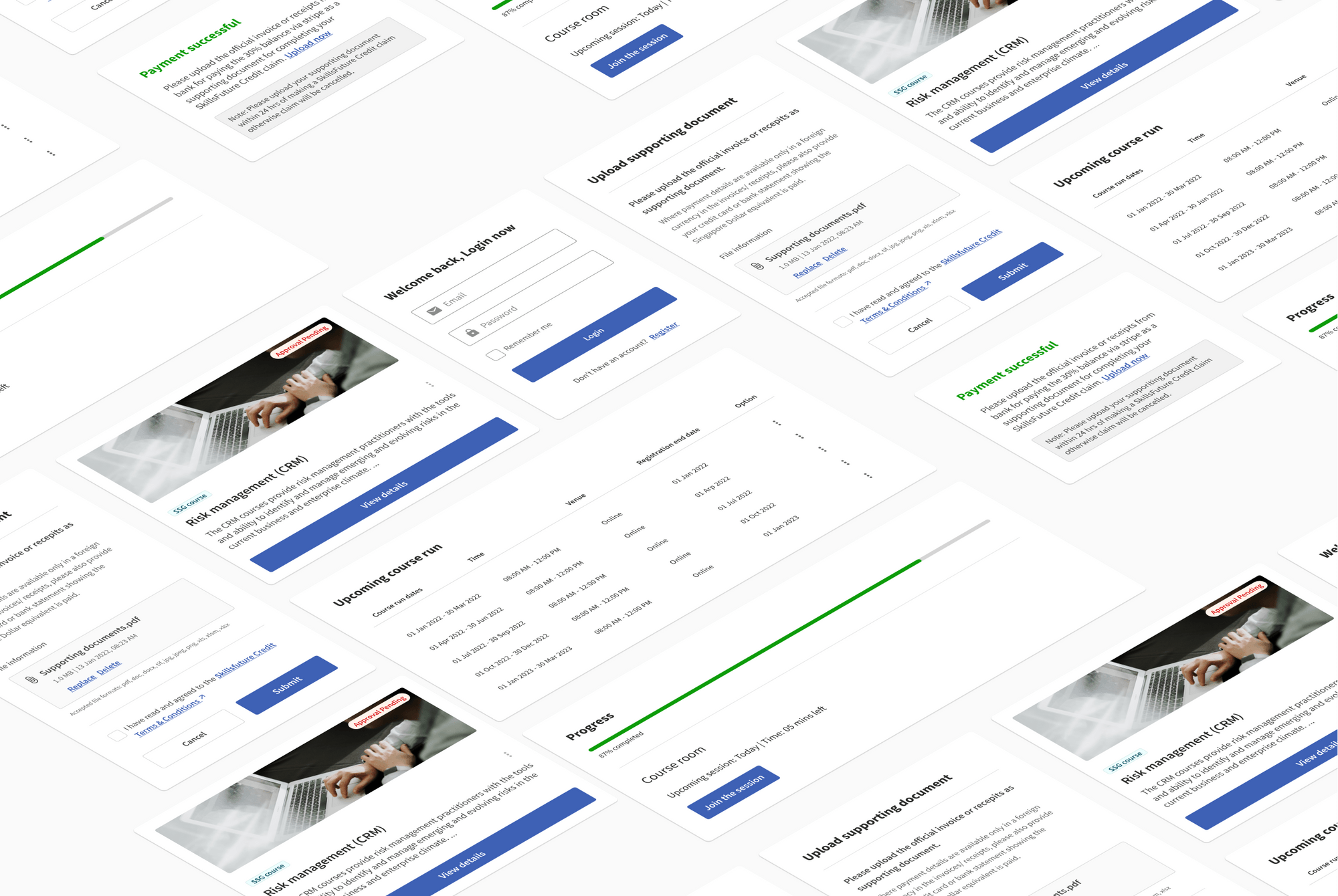
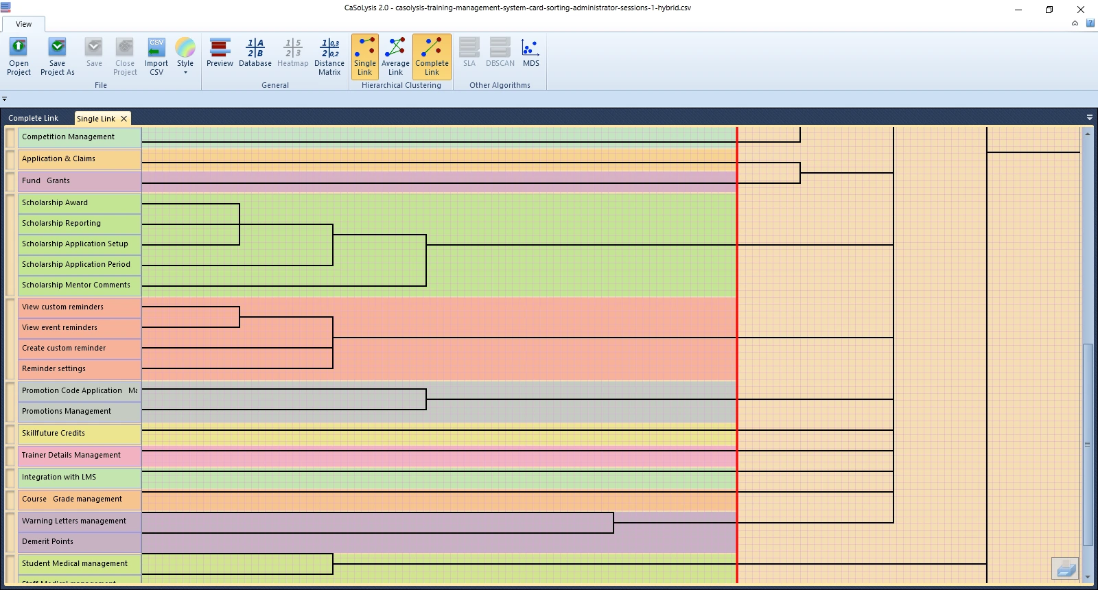
Conducted user interviews to uncover current pain points, gaps, and opportunities within the Training Management System (TMS) and Learning Management System (LMS) products. Additionally, explored existing usage scenarios across both systems to develop a deeper understanding of how users interact with them and to identify areas for improving the overall user experience.
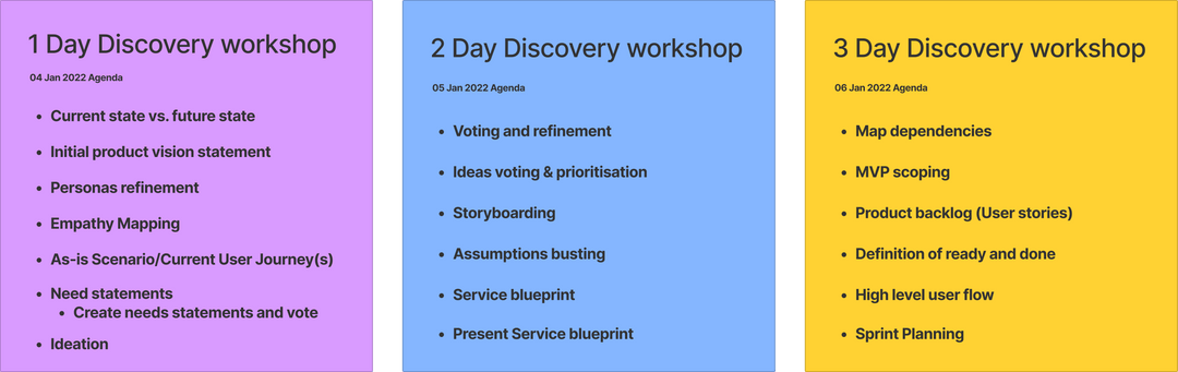
Combined personas from the TMS and LMS products to create a unified set of proto-personas. Based on insights gathered from user interviews, crafted concise need statements that clearly represent user requirements. These need statements were then prioritized through a voting process informed by user feedback. Further validation was carried out by mapping the customer journey to better understand user interactions and identify key pain points. Throughout the process, engaged with users from First Media and KAS to ensure a diverse and well-rounded perspective.
Conducted affinity mapping to group related ideas and uncover patterns and themes within the need statements. Led feature brainstorming sessions to explore potential features and enhancements, and used storyboarding techniques to visualize user interactions and possible user flows. Additionally, performed assumption busting exercises to challenge and validate key assumptions made during the workshop.
Focused on developing a service blueprint to understand the end-to-end user journey, identify key touchpoints, and uncover potential dependencies. Mapped relationships between different features and components to clarify how they interact, and prioritized features based on their impact and importance to create a structured prioritization list. Built a comprehensive product backlog outlining desired features and functionalities for future iterations, and developed a high-level user flow to visualize how users would navigate through the product.
Product Goal
Addressing this with a dynamically all-in-one eLearning platform to reduce manual processes and make course management and delivery of content more efficient for training providers and learners by having a simple process that help users to automate processes and being govt approved when required.
Addressing this with a dynamically all-in-one eLearning platform to reduce manual processes and make course management and delivery of content more efficient for training providers and learners by having a simple process that help users to automate processes and being govt approved when required.
Kickstarting with a research plan, the ultimate aim is to understand the how educators manage the ongoing management activites and how educators plan, perceive contents and their possible needs, and the feature required to run a seemless process. (Research method: Indepth user interviews and Secondary Research and competative analysis)
With that, the possible user flows are being mapped out after the discovery workshop, before conceptualising the main screens, we went on producing a combaining information architecuture and Userflow to validate them with Project owners.

After concluding the ideation phase, we took the finalized ideas to our board and began working on them. As designers, we diligently crafted mid-fidelity wireframes, mock-ups, and prototypes based on the agreed-upon concepts. These designs were then put to the test through usability testing, where we gathered valuable feedback from users.
With the insights gained from the usability testing sessions, we iterated on the designs multiple times, incorporating necessary improvements and addressing any identified usability issues. This iterative process allowed us to refine the designs, ensuring they were intuitive, user-friendly, and aligned with the desired user experience.
Once the designs were polished and finalized, we handed them over to the development team. The handover process involved providing the developers with all the necessary documentation, assets, and specifications required to implement the code accurately. This included detailed design specifications, style guides, graphical assets, and any other relevant materials.
By handing over the finished designs to the developers, we ensured a smooth transition from design to development. The developers could rely on our comprehensive deliverables to accurately translate the designs into functional code, aligning the final product with the envisioned user experience.
Through effective collaboration and a structured handoff process, we aimed to seamlessly bridge the gap between design and development, enabling the successful implementation of our designs and the realization of the project's goals.
-p-1080.png)
-p-1080.png)
Finally, I ran an assumption-busting exercise by explicitly listing IMDA’s original design assumptions and systematically testing each against collected evidence. This step ensured the redesign strategy was based on user realities rather than unvalidated expectations.
Testing
The hi-fidelity prototype was tested with a small group of users on a objective (to find out the usability of the admin solutions)- test overall usability, of the proposed solution. By conducting Scenario based task usability test, users were asked to complete three tasks while they were requested to think out loud, listed below
Being an admin you have been requested to create a new course run. How will you do it?
Since being an admin you have responsibility to approve the list of users expressed interest on the course run, so you need to view the details of the person Daniel Tan and then approve him to the course run. How you do it?
Now you need to create a new user called Jonson and assign him as a trainer to a risk management course run. Let's do it?
Their were another rounds of usaility testing for admin to iterate in the solutions which needed improvements.

Iteration
During the usability testing phase, valuable feedback was gathered, and areas of improvement were identified. These usability issues were carefully documented and addressed during the iterative design process. I made it a point to conduct multiple rounds of usability testing, ensuring thorough evaluation and refinement of the design.
To achieve this, I conducted more than two rounds of usability testing for each persona, carefully selecting participants who represented the target audience. By testing the design with different individuals who embodied the characteristics of the intended users, I gained diverse perspectives and insights into the usability of the website.
The usability testing sessions provided an opportunity to observe users interacting with the design and gather their feedback and suggestions. These insights were then used to iterate on the design, making necessary improvements and refinements to enhance the overall user experience.
By conducting multiple rounds of usability testing and incorporating the feedback received, I ensured that the design not only met the requirements and goals of the project but also addressed the specific needs and expectations of the users. This iterative approach allowed for continuous improvement and optimization of the design, resulting in a more user-friendly and effective website.
Once the necessary refinements were made based on the usability testing insights, the design was ready for the handoff to the development team. The documentation and assets provided to the developers included the updated and improved design, addressing the usability issues that had been identified and resolved during the iterative process.
By emphasizing multiple rounds of usability testing and incorporating user feedback, I aimed to create a design that truly resonated with the intended audience and provided them with a seamless and satisfying user experience.
Handoff
Throughout the project, I utilized Zeplin as the primary tool for delivering designs to developers, ensuring a smooth and efficient handoff process. I recognized the importance of providing developers with comprehensive information and went the extra mile to produce a proper handoff. This included clear instructions, specifications, and guidelines for various design elements and considerations.
Firstly, I provided detailed guidelines for visual design elements such as colors, typography, icons, and visual styles. This ensured consistency and coherence across the website, allowing developers to accurately implement the intended design aesthetic.
Interactive elements were another crucial aspect, and I provided comprehensive instructions for components like buttons, links, dropdowns, and menus. These instructions helped developers understand the intended behavior and functionality of these elements, ensuring a seamless user experience.
Form elements and data validations were addressed through detailed design guidelines. I provided specifications for input fields, checkboxes, radio buttons, and dropdowns, enabling developers to implement proper data validation and user feedback mechanisms.
Error states, an important consideration in user interfaces, were covered as well. I provided clear instructions and visual representations for handling error scenarios, such as highlighting invalid form fields and displaying error messages. This facilitated effective error handling and improved the user experience.
To account for loading and empty states, I included design specifications. Developers received guidance on indicating loading activity and progress to users, as well as instructions for displaying appropriate content when there is no data to show. This ensured a consistent and informative experience for users in different situations.
Animations were also addressed in the handoff process. I provided guidelines for transitions, micro-interactions, and page animations, allowing developers to implement engaging and intuitive motion throughout the website.
Copy guidelines were included to ensure consistency in tone of voice and messaging. Clear instructions were provided to help developers maintain the intended style and tone of the content across the website.
To illustrate user journeys and navigation, I provided detailed flowcharts and diagrams. These visual representations allowed developers to understand the intended flow and structure of the website, enhancing their ability to implement the design effectively.
Accessibility information was another important consideration. I provided guidelines to meet accessibility standards, including recommendations for contrast, keyboard accessibility, and alternative text for images. This aimed to ensure an inclusive and accessible experience for all users.
Finally, responsive design breakpoints were included in the handoff. Specifications were provided to guide developers in adapting the layout and elements of the website to different screen sizes and devices, ensuring a consistent and optimized experience across various platforms.
By providing thorough documentation and instructions for these various elements, I aimed to facilitate a smooth and successful collaboration between designers and developers. The comprehensive handoff ensured the accurate implementation of the design, resulting in a high-quality, user-friendly, and visually appealing website.

Solutions
The solution I designed was a complete Wireless@SGx ecosystem redesign: transparent, unified, accessible, and actionable across all platforms.
Users reported overwhelming 15-step setup processes requiring technical knowledge and creating barriers across all platforms.
Reduced setup time from 11+ minutes to under 3minutes while increasing completion rates from 36.7% to 78%.
Seniors faced 80-100% confusion rates with no accessibility features available, creating systematic exclusion
Increased senior user success rates from under20% to over 75% while maintaining modern, appealing design for all users.
Simplified 3-Step Setup
Users reported overwhelming 15-step setup processes requiring technical knowledge and creating barriers across all platforms.
Consistent Profiles
Each platform (iOS, Android, Windows, macOS)provided different setup flows, forcing users to "re-learn" processes for each device.
I created a comprehensive design system ensuring95% feature parity across all platforms
Accessibility-First Design
Seniors faced 80-100% confusion rates with no accessibility features available, creating systematic exclusion
Reflection


.jpg)
.jpg)